Never losing your place in a six-month case
A clearance adjudication portal, redesigned on ServiceNow from three days of watching reviewers work
The constraint
Clearance adjudication is a long-running, multi-track process. A single case can sit open for months while a background investigation, reference interviews, a financial review, and a psychological evaluation each proceed on their own timeline. Reviewers carry two dozen cases at once and hand them to each other.
That produces a specific and unglamorous problem: the interface has to answer "where am I, what has already happened here, and what is waiting on me" every single time someone returns to a case, and they return constantly.
The research
Before any design work, I spent three days on-site shadowing nine reviewers across two shifts, followed by twelve one-on-one interviews and a review of six months of help-desk tickets. Watching people work revealed problems no requirements document would have surfaced.
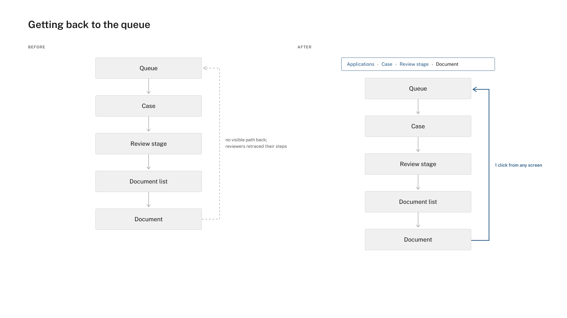
The most consistent and consequential was navigation. Reviewers were getting lost. A case would take them several layers deep (into a specific document, a specific review stage, a specific applicant record), and getting back to their queue meant retracing steps the interface didn't support. Several kept a second browser tab open on the queue purely as a way home. They were rebuilding their context repeatedly through the day, which cost time and introduced error.
The second was persistent information. Case status, priority, assigned reviewer, and upcoming deadlines lived on one screen and vanished when you left it. Reviewers were memorizing or writing down information the system should have been holding for them; one had a legal pad of case numbers and due dates beside her keyboard.
The third was orientation. At any given moment, reviewers struggled to answer a simple question: where is this case? What's done, what's in progress, what still needs to happen?
The approach
The redesign was built on ServiceNow, which meant working within a defined platform rather than designing from scratch. This is a more constrained problem and in some ways a harder one. The question isn't what the ideal solution is, but what the best possible solution is inside an existing system. Every decision had to be right for the user and achievable with the platform's components. I worked screen by screen with the two developers to confirm that, so nothing in the wireframes was a promise the build couldn't keep.
The three research findings became three persistent patterns that appear on every screen.
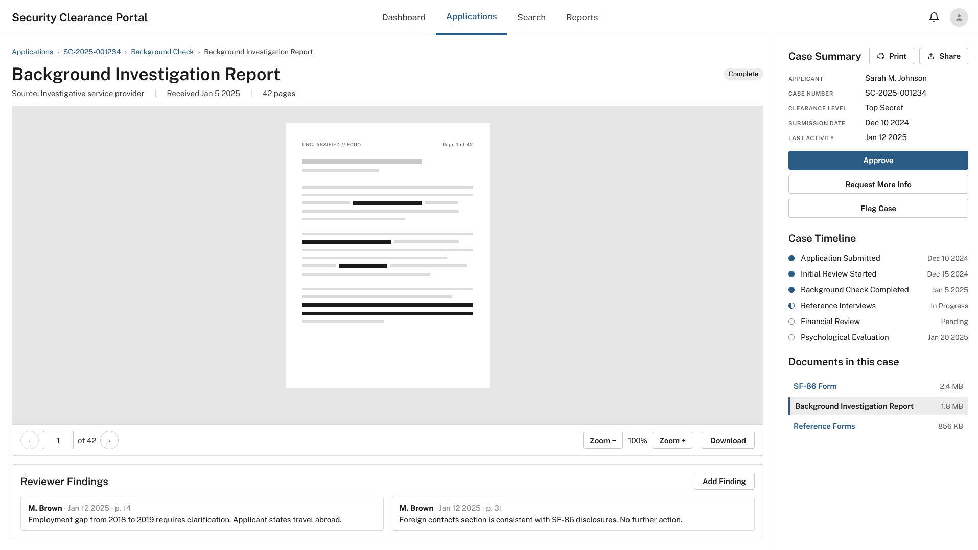
Breadcrumb navigation. Every screen shows the reviewer exactly where they are and gives a one-click path to any level above. Moving from the queue into a case, into a review stage, into a document never costs the reviewer their way back.
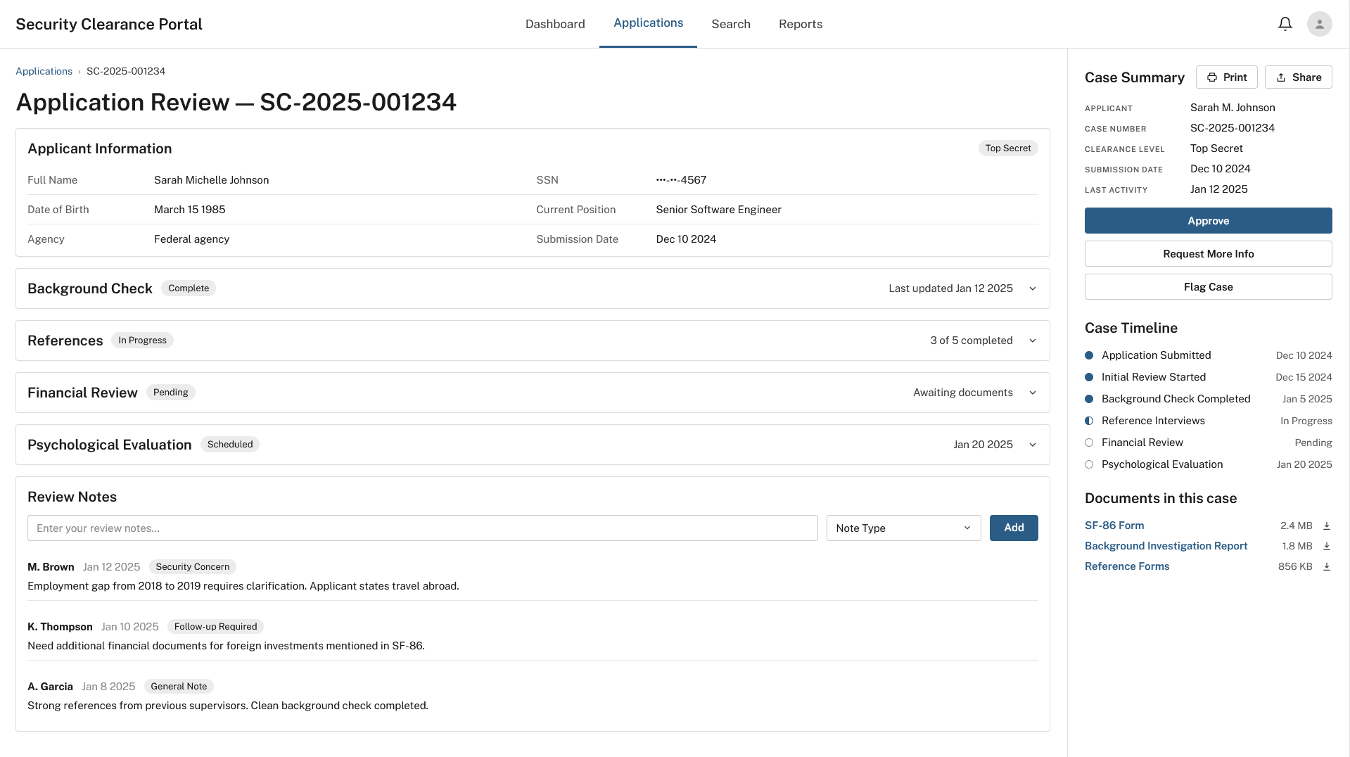
The persistent Case Summary. The right sidebar of every case-level screen holds the same information regardless of where the reviewer is within the case (applicant, case number, clearance level, submission date, last activity) and the three primary actions: Approve, Request More Info, Flag Case. It stays because reviewers need it throughout, not just when it's first displayed. The legal pad went away.
The Case Timeline. Every case-level screen includes a vertical timeline of milestones (completed, in progress, pending) in the same sidebar. In usability testing with six reviewers, every participant answered "where is this case?" correctly in under three seconds without navigating anywhere.
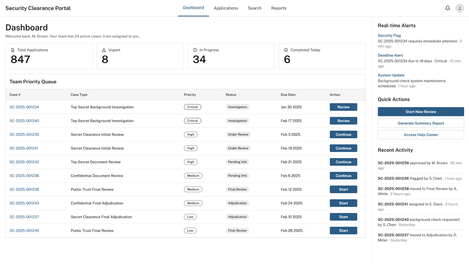
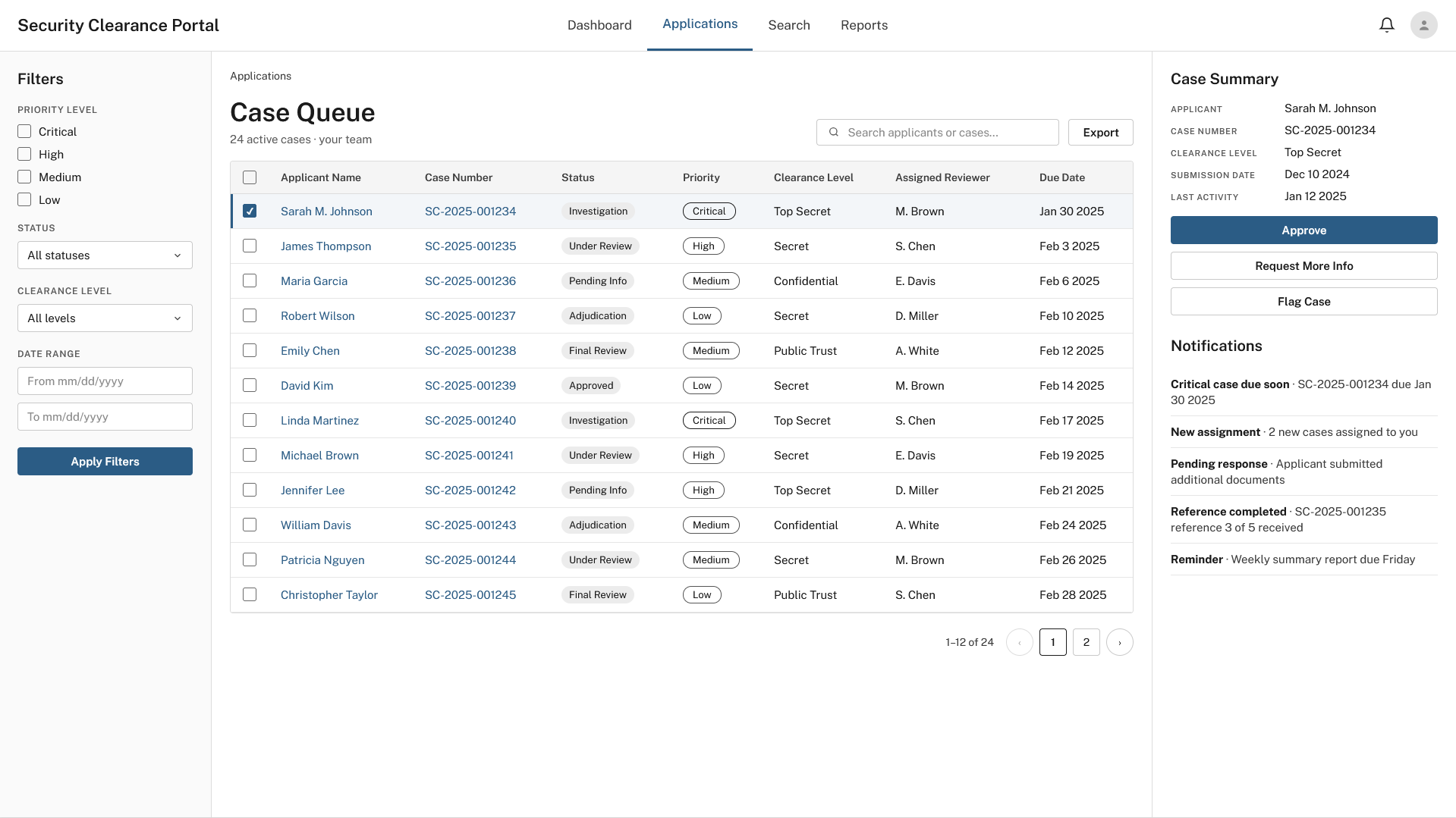
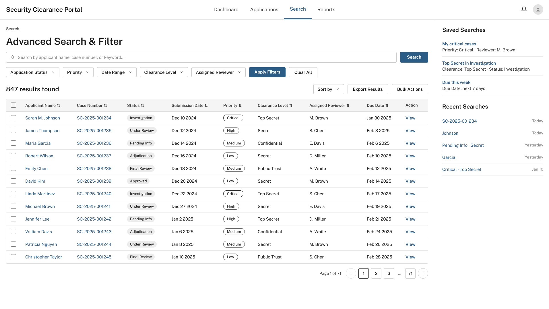
Two further pieces addressed workload rather than orientation. The Priority Task Queue on the dashboard gives reviewers arriving for a shift the day's order of operations without having to construct it themselves: urgent cases at the top with their next action, in-progress cases with their current state and due date. Advanced Search lets a reviewer find one case among hundreds by filtering on status, priority, clearance level, reviewer, and date range simultaneously, and save the searches they run every morning.
The outcome
Every major design decision in the portal traces back to something observed in the field rather than assumed at a desk. The portal was built and deployed on ServiceNow across the office's review teams. In the first quarter after launch, navigation-related help-desk tickets fell to a handful from what had been the single largest category, and the reviewers I'd shadowed reported that the second-tab and legal-pad workarounds were gone. The persistent sidebar pattern was later adopted as the standard for the agency's other ServiceNow case applications.
I was not the developer. My role was research, interviews, observation, wireframing, and design, and the collaboration between rigorous research and careful platform-constrained design produced a system that works the way its users actually work, rather than the way a system architect imagined they might.
Screens recreated for this portfolio with fictional data.