Designing for the decision a regulator will ask about
A breach-notification workflow for in-house counsel, built for a legal-tech startup with no spec and a clock running
The problem
When a company discovers a data breach, its general counsel inherits a problem with three properties: the facts are incomplete, the deadlines are already running, and every decision will later be reviewed by someone whose job is to ask why. Different regulators want different things on different clocks (GDPR gives you 72 hours, some U.S. states say "without unreasonable delay," federal health rules give you 60 days), and whether a given person needs to be notified at all can depend on a judgment call about whether two messy records describe one human or two.
The startup had built the engine for this: it could ingest the exposed files, find the personal data, and match records to people. What it had was a static HTML page that showed all of that at once. What it needed was a product a lawyer could use at 9 p.m. on the worst day of their quarter.
Where I started
There was no spec. For the first three weeks I reverse-engineered the product from the HTML file and from conversations with the founders, one of whom had lived this problem as counsel. I kept a running written list of every product decision as I made or proposed it, not to cover myself, but because a team of three moving fast needs one place where "what did we decide" has an answer. That list became the de facto spec, and the pattern of proposing a direction rather than asking an open question is what kept an eight-week engagement moving.
The research was lean by necessity: the founders, two general counsel from their network who walked me through real breach responses they'd handled, and the notification statutes themselves. Two things shaped everything. First, counsel don't want a dashboard; they want to know what needs them right now and what will happen if they wait. Second, the identity question (one person or two?) is the decision they most fear getting wrong, because either error is a violation in one direction or the other.
Three decisions
1. One question at a time, with the consequence stated. The system resolves most identities on its own. The ones it can't are put to the lawyer one at a time, as a plain question with the two sets of records side by side, and a sentence explaining what each answer does to the notice list. The lawyer decides from the summary; the evidence is one click away if they want to check.
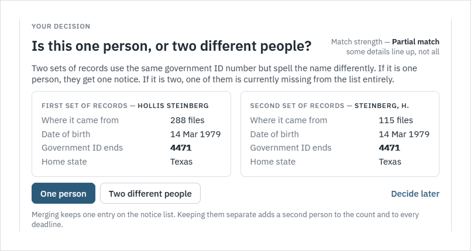
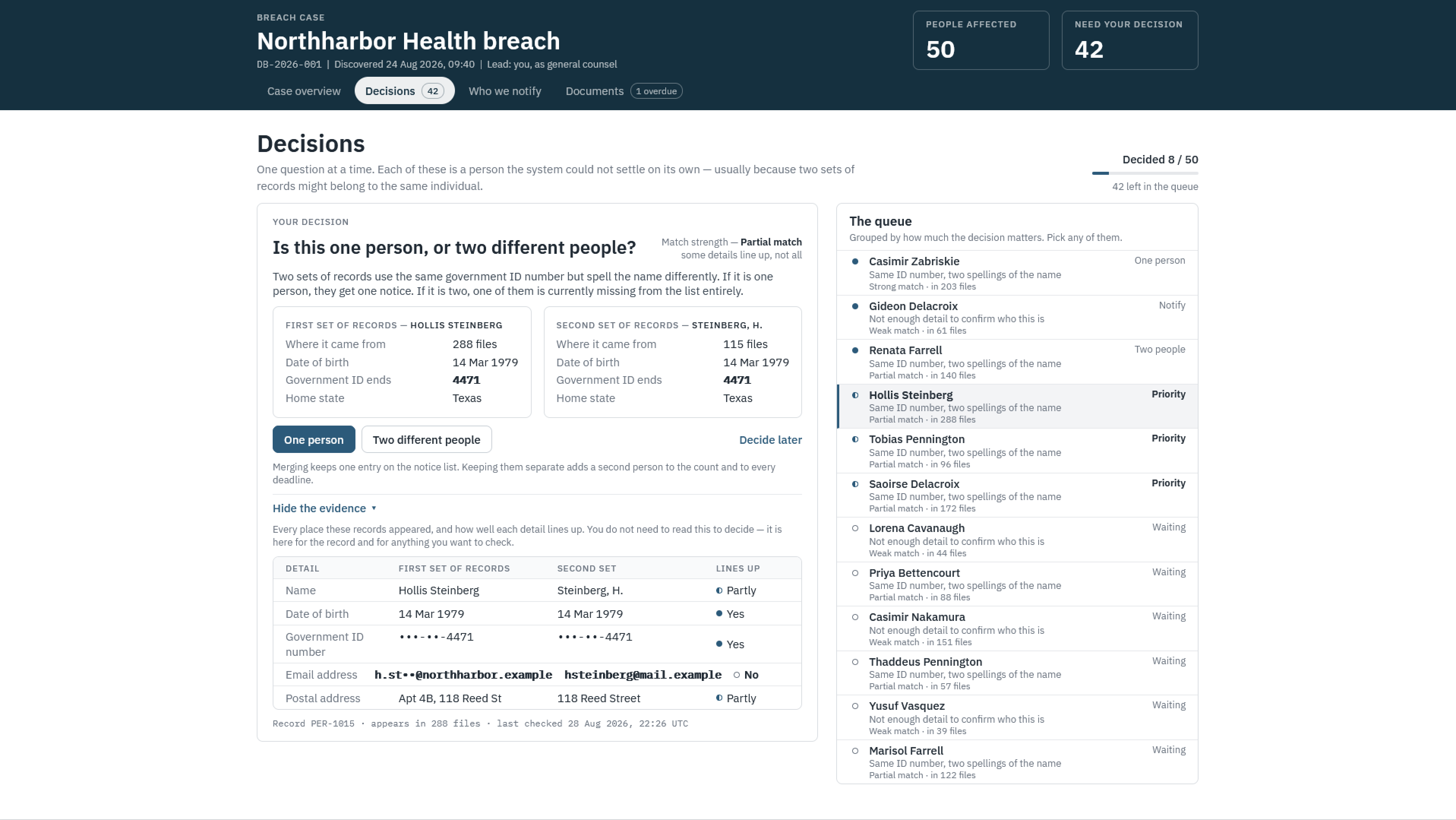
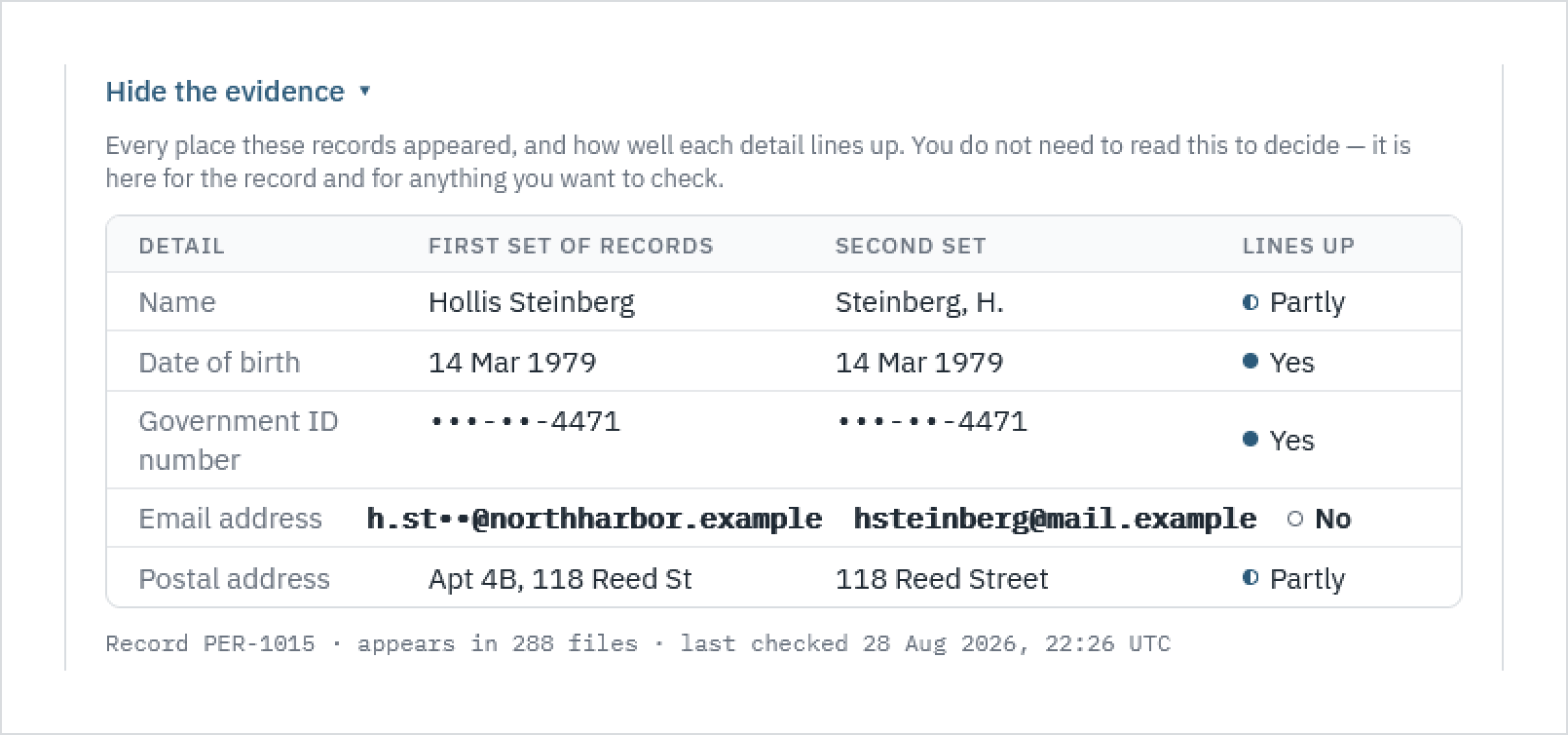
2. Evidence for the record, not for the decision. Every decision screen can expand a detail-by-detail comparison of where the records came from and how well each field lines up. The copy says outright that you don't need to read it to decide. It exists because a regulator may later ask what the lawyer knew when they made the call, and because some lawyers will want to check. Both audiences are served by the same table.
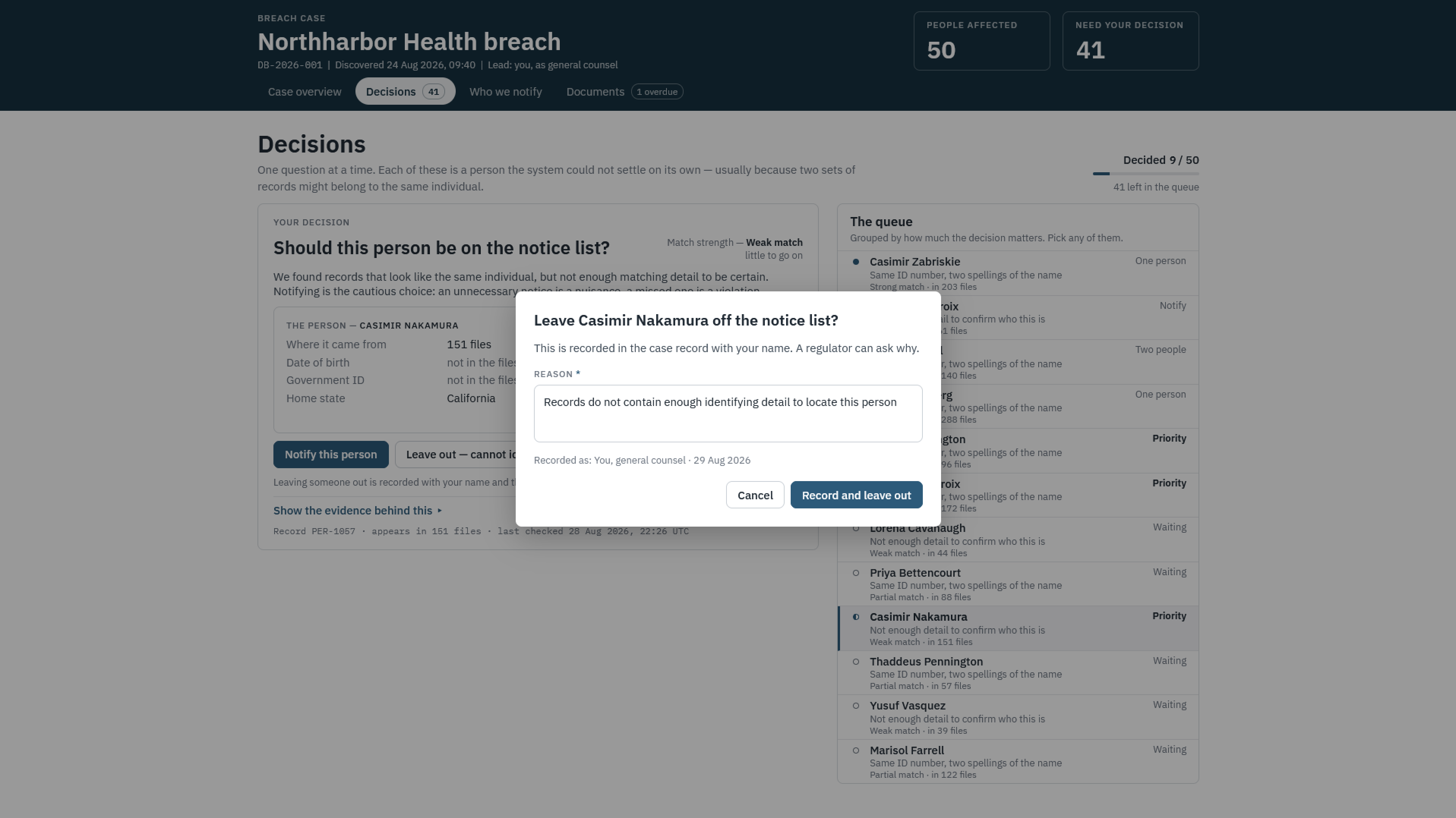
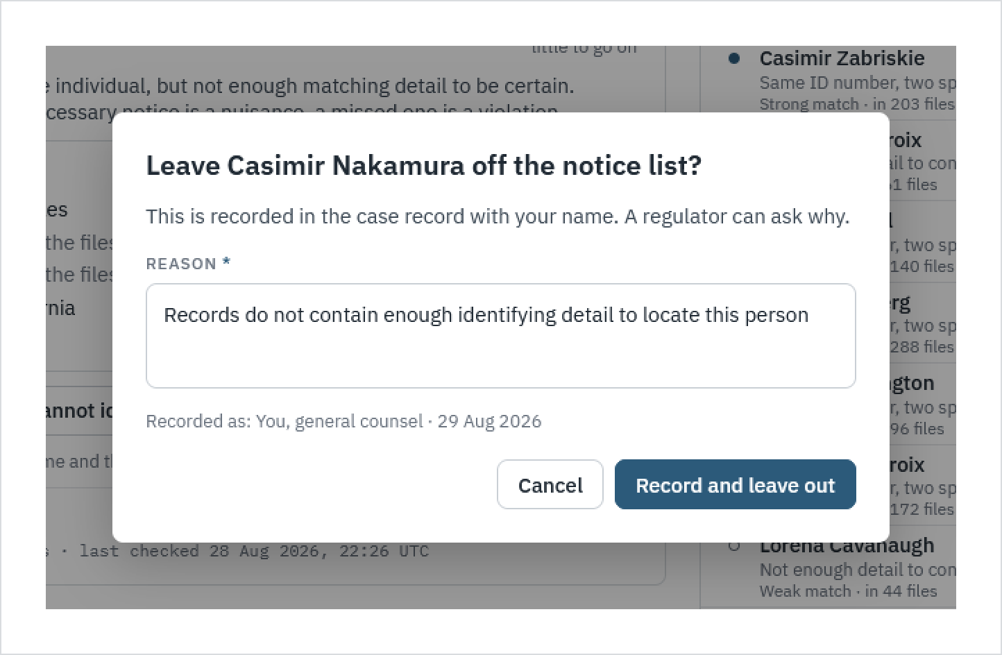
3. The consequential action carries its own justification. Leaving someone off a notice list is the decision most likely to be questioned. So that action asks for a reason, tells the lawyer it will be recorded in their name, and puts the confirmation in the same voice as the rest of the product: a regulator can ask why. Notifying is the default; leaving out is deliberate.
The voice
Most of the design work in this product is in the sentences. The interface never says "entity resolution" or "match confidence score." It says "some details line up, not all." It doesn't show a deadline as a date; it says "23 days left" and, where the clock has already run out, "late by 1 day and 9 hours. You can file now with what you know and supplement later." I wrote every line of interface copy in the voice of a calm colleague who has done this before, because that is the thing a general counsel actually lacks at the moment they open the product.
What the engagement produced
Four rounds of clickable HTML prototypes, each versioned and each reviewed with the founders against the decision list. The final round covered the full workflow: case overview with live deadlines and a projection of whether the case would clear them, the decision queue, the notice list, and the documents the case has to produce. The product was pre-launch when my engagement ended; launch and adoption are the company's to report.
Screens shown with fictional data. Additional screens available on request.