Teaching a six-year-old to fly a hawk without a single word
A gesture-controlled exhibit for a regional nature center, designed for children who can't read yet
The challenge
Most interactive exhibits rely on the same three assumptions: users can read, users can tap, and users understand that a screen is something you touch. This project removed all three.
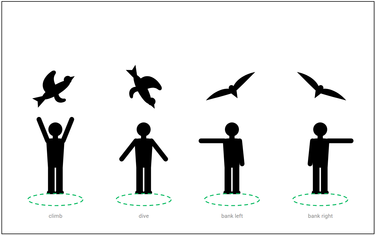
The brief was a gesture-based hawk flight game for a nature center's raptor gallery, intended for children as young as six. Players would control a hawk on an eight-by-five-foot display using only their body (arms up to climb, arms down to dive, an arm extended to turn), tracked by a depth camera. No touchscreen, no buttons, and no instructions written in any language. The system had to teach itself to every child who stood in front of it, in under a minute, without words.
The constraint that shaped everything
The no-written-language rule was a functional necessity, not a stylistic one. A nature center serves an enormously varied audience: children who can't yet read, children whose first language isn't English, grandparents, school groups of thirty. Every piece of communication the system needed to do (teach the gestures, confirm the child was being tracked, signal success, signal failure, show progress, handle errors) had to happen entirely through motion, imagery, and visual feedback. The design vocabulary was body language, color, and animation. Nothing else.
What I learned from children
I tested twice with children at the center: eleven in the first round, ages five to nine, on a projected prototype; fourteen in the second, on the installed display. Three findings shaped the design.
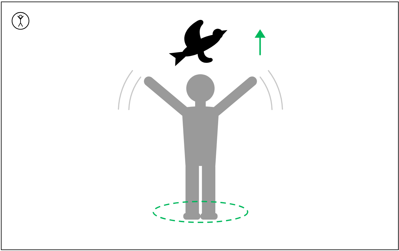
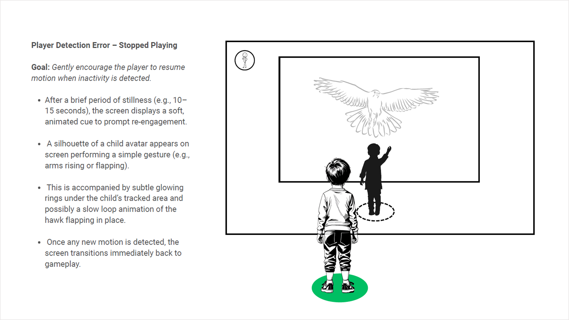
First, children mirror before they understand. Shown a silhouette raising its arms, every child raised theirs within a few seconds, before they'd worked out that the hawk was responding to them. That's the whole onboarding: the system doesn't explain, it demonstrates, and the child copies. Second, a red X ends the session. In the first round the miss state used a conventional failure cue, and three of eleven children walked away after their first miss. Third, children under seven don't count, but they do see circles fill up. Progress had to be shape and color, not numbers.
Three decisions
1. Poses that read as silhouettes. Each gesture was designed as a distinct, unmistakable physical shape: arms fully raised for climb, arms angled down and forward for dive, one arm extended horizontally for a turn. The poses were chosen for clarity as silhouettes, because a child sees the prompt in peripheral vision as a ghosted figure on screen and shouldn't have to look away from the hawk to copy it.
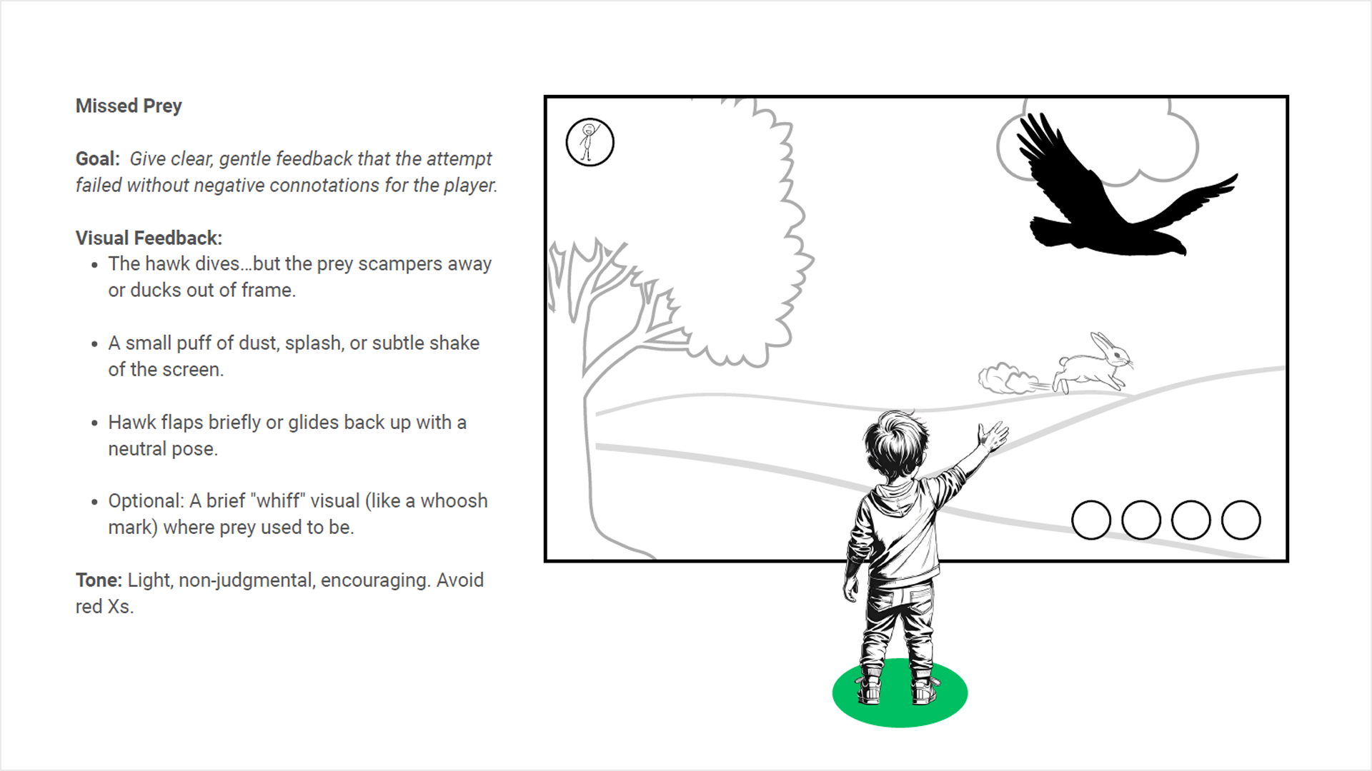
2. Failure that re-engages. A child who misses sees the hawk glide back up in a neutral pose and a small puff of dust where the rabbit was. No X, no alarm, no sound of something going wrong. The game simply resets and invites another attempt. For a six-year-old, the difference between an error state that discourages and one that re-engages is the difference between a child who walks away and one who tries again, and after the miss state was redesigned, no child in the second round left after a miss.
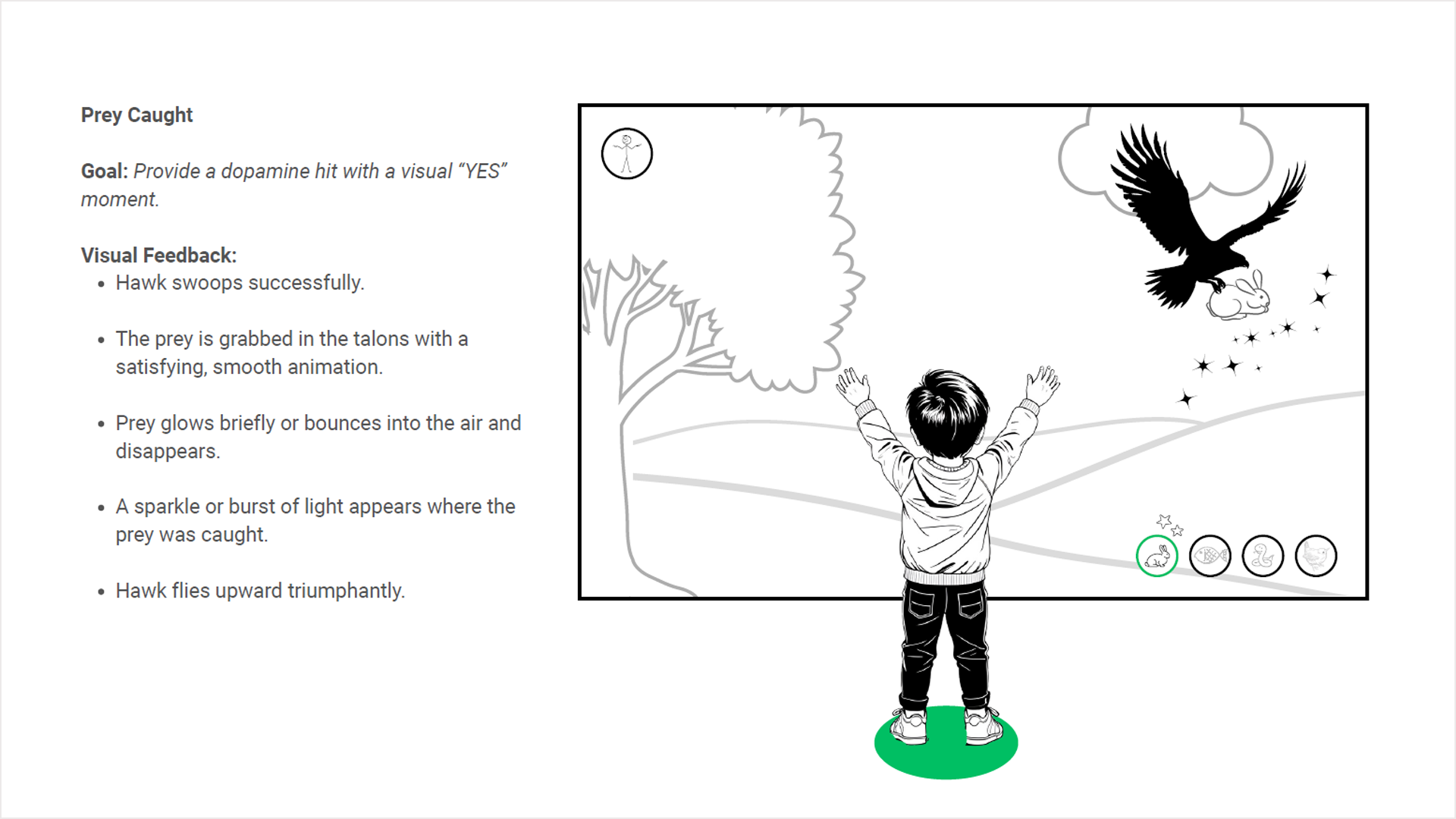
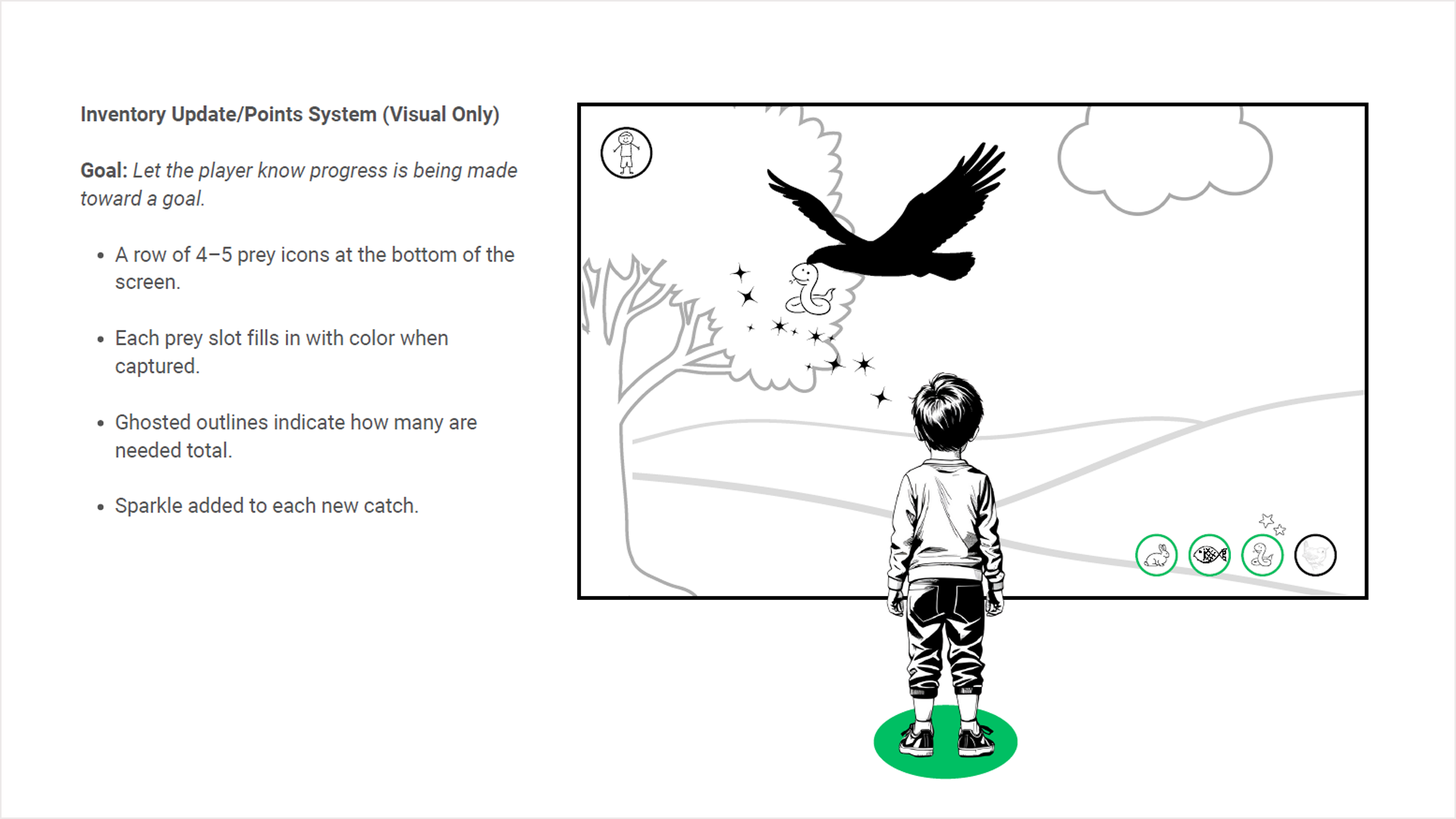
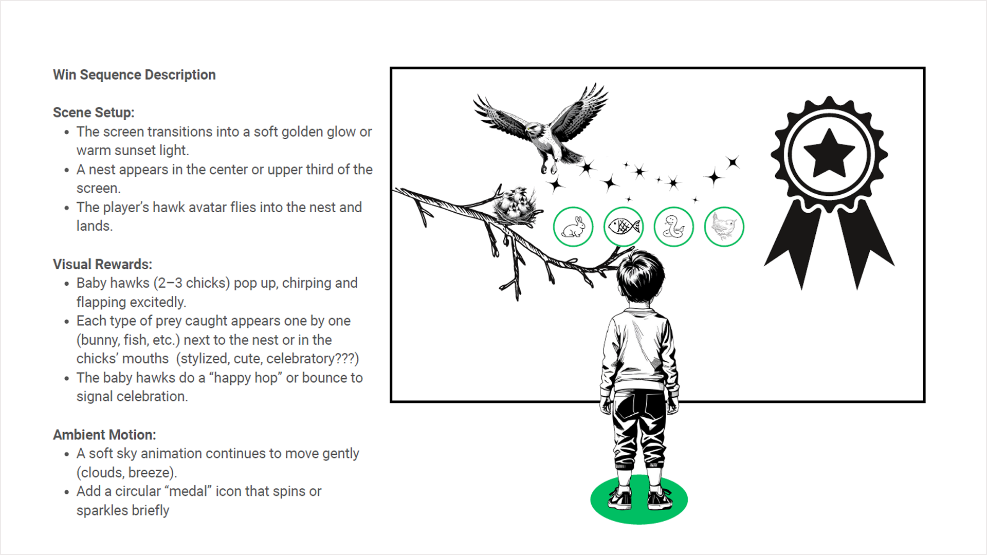
3. Progress you can see without counting. A row of prey icons along the bottom of the screen, ghosted until each animal is caught, then filled with color and a sparkle. A child who can't count can still understand that circles are filling up and something good is happening. Catching all of them flies the hawk home to a nest of chicks.
The states nobody thinks about
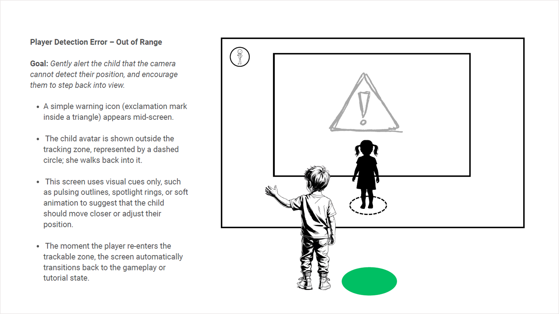
A camera-tracked exhibit spends much of its life in error. Children step out of range; they stop moving to watch; a second child walks into frame. Each of these needed a wordless recovery. If the child goes still, a ghosted figure gently flaps its arms and the hawk hovers, waiting. If the child leaves the tracking zone, a soft warning and a silhouette stepping back into a dashed ring show what to do. The moment the camera reacquires them, gameplay resumes with no menu and no restart.
The outcome
The exhibit was built and installed in the nature center's raptor gallery. In the second round of testing on the installed display, children onboarded in thirty to forty-five seconds from stepping onto the mark, and the center's education staff reported that it had become the gallery's highest-dwell-time exhibit within its first month. The complete interaction system (every game state and error state) runs on motion, imagery, and cause-and-effect feedback, with no text, no touch, and no prior knowledge required. It works for non-readers, for children who have never played a video game, and for visitors who speak any language.
It is also, in my experience, one of the purest UX problems I have worked on. When you remove language entirely, every design decision becomes a question of whether the system is actually communicating, whether the experience itself is legible.
Screens recreated for this portfolio with fictional data.